Communicating our brand through design requires a toolbox of graphic elements that reflect our identity and help us stand out. These elements create a distinctive look and provide flexibility for Iowa’s diverse audiences.
Textures and patterns
Textures and patterns, in combination with photography and other design elements, can create dynamic and engaging visuals that add depth to design layouts.
These patterns can be used as a background texture, or as a graphic that interacts with text or images. You are not required to use the entire pattern. It can be cropped to fit a specific area of a design.

Brain rock
Inspired by Ridge and Furrow, an iconic sculpture that sits on campus and is said to bring good luck to students who touch it before taking tests, the pattern mirrors the etching on the boulder, which is made of an endless ridge flanked by V-shaped grooves or furrows.

Particles
A nod to Iowa’s historic legacy in space science, the particle pattern is an abstract representation of particles in space. The pattern is made up of repeating circles at varying opacities to create depth and movement.

Community
Iowa’s campus is inseparable from Iowa City—one of the best college towns in the country. Using a consistent style with the brand iconography, the community pattern pieces together the most recognizable icons of our campus and community.
Iconography
Icons can enrich sparse content and represent complex or detailed concepts in a way that helps audiences process information. With their illustrative quality, icons offer contrast to blocks of text and photo-driven content.
Icon Browser
Our icon set consists of 500+ unique icons to fit your needs. Use the Icon Browser to search by keyword or browse by category to find the icons you're looking for. Then download the icons you need in the color and file format that works best for your project.
Using icons
Icons are provided as SVG and PNG files. SVG files are intended for web use; for print projects, convert SVG files to EPS using Adobe Illustrator or cloud convert to ensure that icons print clearly at any size. PNG files can be used in digital applications and are ideal for Microsoft Office products, such as PowerPoint.
- Enhance content by creating visual interest. Icons should be directly relevant to the information you’re communicating and be used to compliment content, not distract from it.
- Do not use icons as a central or large graphic element. Icons should only be used to supplement a fact, header, or text block. They should not be used as the primary visual.
- Icons are not for unit identification. Icons should not be used alone or combined with college, department, or program names to form a logo.
- Scale icons proportionally. Icons should always remain at the same scale in relation to each other to create a consistent look. The stroke weight should also be scaled proportionally with the size of the icon. Do not add additional stroke weight to the icon.
Our icon set is built with a distinct look and consistent style, using characteristics from the block IOWA:
- 90-degree inner angles and rounded outer corner joints
- Rounded accents or details are used for contrast
- Constructed of monoweight lines
Do not attempt to create your own icons. If existing icons do not meet your needs, please contact osc-brand@uiowa.edu.
Highlights and lines
Highlights and lines are a useful way to create emphasis or hierarchy within headlines and display text. Styles can be set up within Adobe InDesign to help make them consistent.
Highlight to create contrast
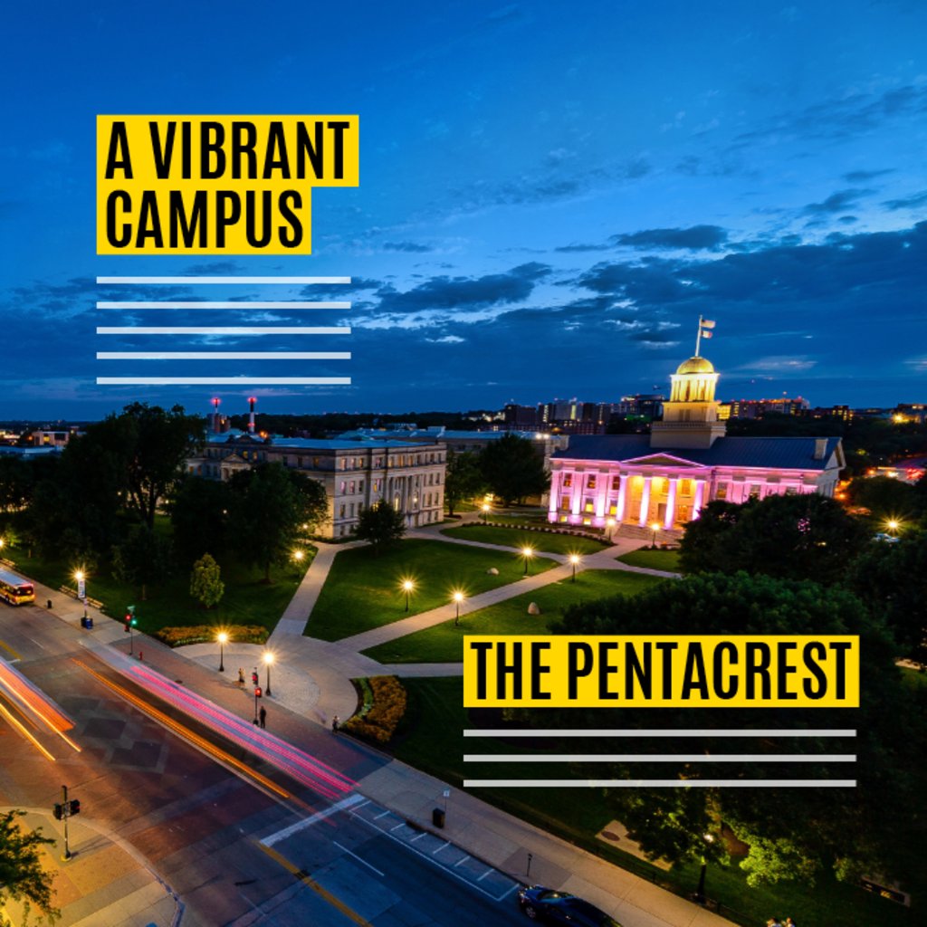
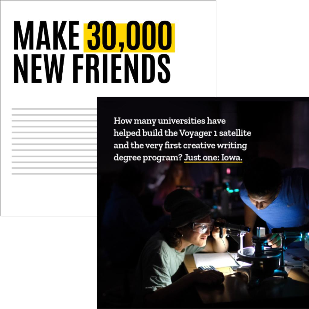
Use highlights to emphasize display text and improve legibility over photography. Using black and gold highlights visually intertwines our brand colors with our messages.
Emphasize words
Align highlights directly behind text or offset slightly when over white backgrounds. Line weights should be consistent and based on other design elements within your layout, for example text weight.

Use lines to organize
Use dividing lines to establish hierarchy and guide navigation within a layout. Always establish a consistent line weight throughout an entire piece.
Charts and graphs
Visually representing data can play an important role in communicating clearly with our audiences. From presenting casual information graphics to detailed research data, the styling used for charts and graphs must support our overall visual identity.
Guidelines
- Use black and gold predominantly. Add secondary colors only when there are several data points to compare within the same graph and more contrast is needed to differentiate.
- Use Roboto for data figures. Roboto Condensed can be useful for displaying data figures when space is limited.
- Don't use narrow bars or make the fill area of a donut chart thin; their visual weight should be consistent, substantive, and feel similar in weight to our block IOWA logo or the highlight element shown above.
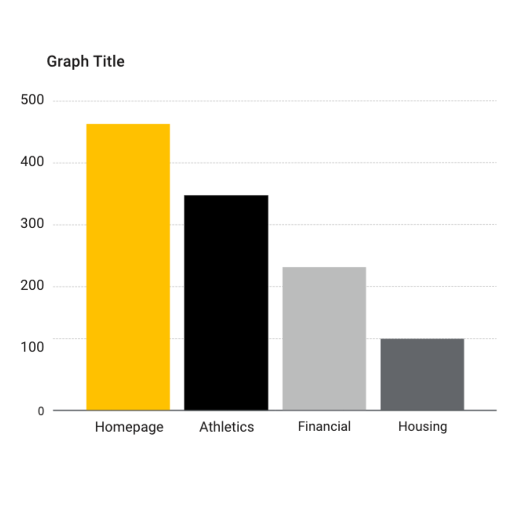
Bar graph
Use bar graphs to compare one data point versus another or to track changes over time. Bar graphs demonstrate large differences better than small ones.
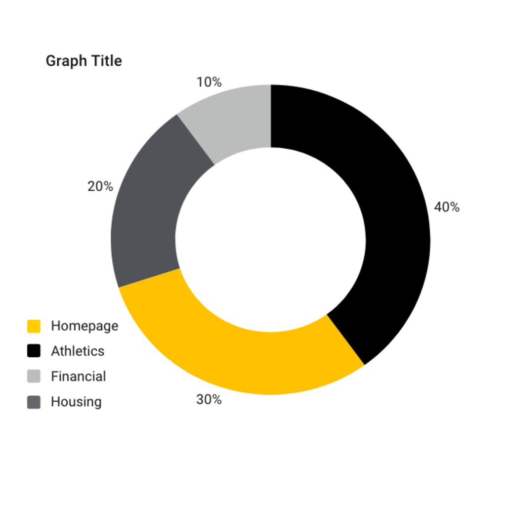
Donut/pie graph
Use donut and pie charts to compare parts of a whole. Aesthetically, donut charts are preferred within our visual identity and offer the ability to show more than one data set in the same chart.
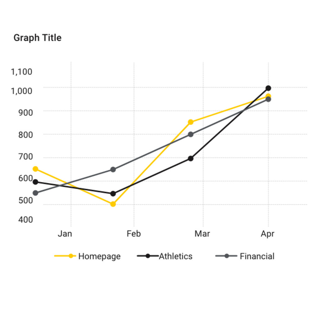
Line graph
Use line graphs to display small changes in a trend over time. Use heavy line weights for better visual density of our black-and-gold color palette, generally 2 to 4 points.
Download our printable visual identity poster to use as a quick reference guide to some of our most important identity elements.