Our black-and-gold color palette is one of the most recognizable aspects of the University of Iowa visual identity, dating back to the 1880s. Using these primary brand colors clearly connects your program and message to Iowa, building recognition and trust with your audiences.
Primary colors
Our gold is the spot color PMS 116 C. For black, use solid or rich-black values.
- Use the recommended values below for CMYK, HEX, and RGB color spaces to achieve the most desirable gold across print and digital platforms.
- Do not use PMS 116 U when printing on an uncoated stock. Every effort should be made by vendors to match the PMS 116 C swatch.
- Use the rich-black formula for a denser black when printing with a four-color process.
Tints and shades
No values other than those listed on this page may be used. Tints and shades of these colors should not be used. The only exceptions to this rule are Black and PMS Cool Gray shades, which may require tints to achieve adequate contrast in some applications.
Download color palette
The complete color palette is available for download to use in Adobe Creative Suite applications. This download includes both the primary and secondary colors in CMYK, PMS, and RGB, packaged in an Adobe Swatch Exchange (ASE) file.

PMS 116 C
CMYK: 0 18 100 0
HEX: #FFCD00
RGB: 255 205 0
Madeira Thread: 910-1069 Classic Rayon #40

Black
CMYK: 0 0 0 100
HEX: #000000
Rich Black: 40 30 30 100
Secondary colors
The secondary color palette was carefully selected to complement and support our primary brand colors of black and gold while creating flexibility to design effective visual communications. Secondary colors are ideal for elements that require differentiation, such as charts and graphs, iconography, updates/alerts, or hyperlinks in web applications.
Use secondary colors sparingly
- Black and gold should always be the most prominent colors used in any marketing materials.
- Secondary colors must not exceed 10% of the total color palette of any design.
- Never use large floods of a secondary color.
- Under no circumstances should secondary colors become the predominant, signifying color for a school, center, institute, or department.

No red. No purple.
Red and purple are not part of our color palette and should not be used for marketing and promotional purposes, or in our campus spaces. Using colors from our neighboring institutions creates confusion for our audiences and fragments our brand identity.
Colors for print:

PMS Cool Gray 4
CMYK: 12 8 9 23
HEX: #BBBCBC
RGB: 187 188 188

PMS 2995
CMYK: 83 1 0 0
HEX: #00A9E0
RGB: 0 169 224

PMS 3405
CMYK: 88 0 68 0
HEX: #00AF66
RGB: 0 175 102

PMS 151
CMYK: 0 60 100 0
HEX: #FF8200
RGB: 255 130 0
Colors for digital/web:
These secondary colors were selected to meet WCAG 2.0 AA guidelines. To ensure a contrast ratio for text (and images of text) of at least 4.5:1, use only white (#FFFFFF) text when using these colors as a background.

PMS Cool Gray 10
CMYK: 40 30 20 66
HEX: #63666A
RGB: 99 102 106

PMS 7462
CMYK: 100 48 6 3
HEX: #00558C
RGB: 0 85 140

PMS 336
CMYK: 95 11 70 44
HEX: #00664F
RGB: 0 102 79

PMS 7598
CMYK: 1 80 88 14
HEX: #BD472A
RGB: 189 71 42
Make sure your text is easy to read and meets contrast ratio standards
Color combinations for digital text display must meet a contrast ratio of at least 4.5:1 in order to be compliant with the University’s IT Accessibility Policy. Gold text on white and white text on gold does not meet this standard and should generally be avoided as a foreground/background pair. Use contrast checkers to ensure your digital text meets contrast ratio guidelines.
Using color
Use our colors strategically to achieve balance and strike the right tone. Prominent use of gold provides the most brand recognition and works well for student recruitment and most marketing efforts. Increasing the use of black or white space works best in formal applications.
Rule of 10 percent
Secondary colors can be used to strategically call attention to information, but must not exceed 10% of the overall color palette. Apply secondary colors in a consistent way throughout your communication.

Formal tone
Increase the amount of black or white space to strike a more formal tone for official invitations, documents, or ceremonies. Limit the use of secondary colors.

Use secondary colors for clear data comparison
When representing data, add secondary colors only when there are several data points to compare within the same graph and more contrast is needed to differentiate.
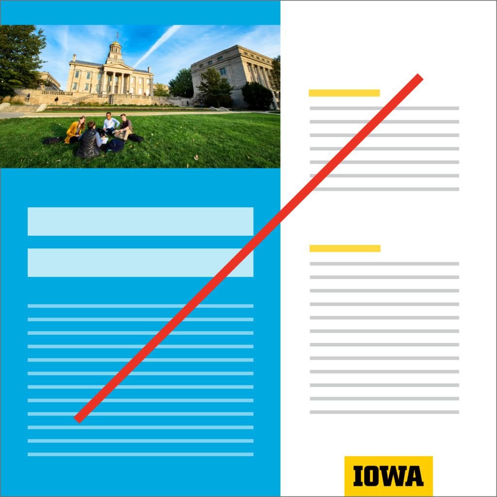
No large fields of secondary color
Don’t muddy the association with the Iowa brand by using large fields of secondary color.

Don't use gold over light-gray backgrounds
Don’t use gold over the light-gray secondary color. It doesn’t provide sufficient contrast.

Don't combine secondary colors with gold
Don’t place secondary colors directly over or under our primary gold and black colors.
Download our printable visual identity poster to use as a quick reference guide to some of our most important identity elements.