Communicating our brand through design requires a toolbox of graphic elements that reflect our identity and help us stand out. These elements create a distinctive look and provide flexibility for connecting with our audiences.
Textures and patterns
Textures and patterns, in combination with photography and other design elements, can create dynamic and engaging visuals that add depth to design layouts.
- Use patterns as a background texture or graphic. You are not required to use the entire pattern; it can be cropped to fit a specific area of a design.
- Use patterns only in approved shades of black, gold, gray, or white. Secondary colors should not be used.
- Don’t change or alter brand patterns in any way. Avoid tilting or manipulating patterns so they become unrecognizable.
- Don’t use more than one color for patterns. Patterns should only be displayed in a single color to ensure readability.

Brain rock
Inspired by Ridge and Furrow, an iconic sculpture that sits on campus and is said to bring good luck to students who touch it before taking tests, the pattern mirrors the etching on the boulder, which is made of an endless ridge flanked by V-shaped grooves or furrows.

Particles
A nod to Iowa’s historic legacy in space science, the particle pattern is an abstract representation of particles in space. The pattern is made up of repeating circles at varying opacities to create depth and movement.

Community
Iowa’s campus is inseparable from Iowa City—one of the best college towns in the country. Using a consistent style with the brand iconography, the community pattern pieces together the most recognizable icons of our campus and community.
Iconography
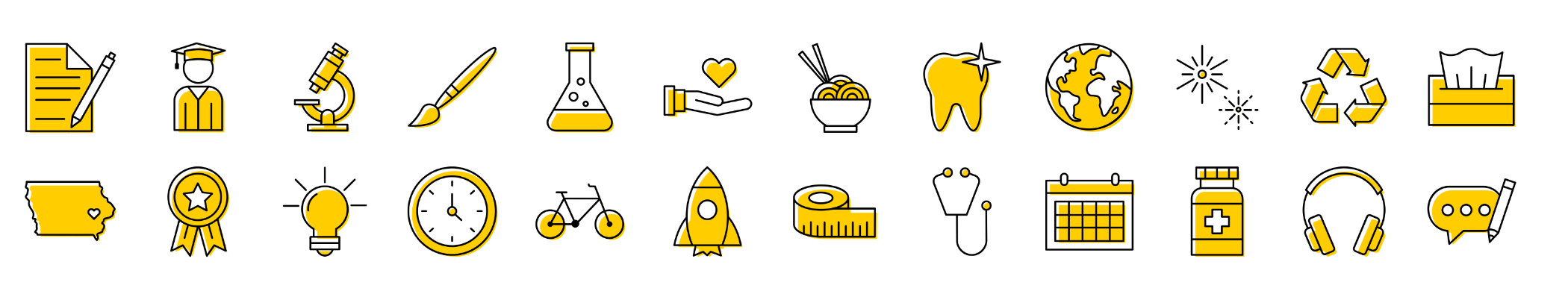
An icon is a simplified, universally recognized symbol used to represent concepts, actions, or categories. Designed to convey information quickly and clearly, icons are helpful tools for effective communication.
Icon Browser
Our icon set consists of 600+ unique icons to fit your needs. Use the Icon Browser to search by keyword or browse by category to find the icons you're looking for. Then download the icons you need in the color and file format that works best for your project.
Usage guidelines
File formats
- SVG: Intened for web use. For print projects, convert to EPS using Adobe Illustrator or Cloud Convert.
- PNG: Ideal for digital applications and Microsoft Office products such as PowerPoint.
Using icons
Be strategic.Use icons to clarify or highlight ideas, not just for decoration or to fill space. Avoid using the same icon to represent different concepts.
- Always pair with content. Icons should supplement content, not stand alone. They provide visual cues but need context.
Don’t use as identification. Don’t combine icons with logos, official lockups, or use to represent a university college, unit, or program.
Scale proportionally.Keep icons the same scale relative to each other to ensure a consistent appearance. Always scale the stroke weight proportionally to the size of the icon. Don’t add additional stroke weight.
Consider whether an image or illustration might be more effective. Icons represent simple ideas that are universally understood. When conveying complex ideas or messages, consider whether an image or illustration might be more effective. Images and illustrations provide more detail, context, and visual expression for your audience.
Our icon set is built with a distinct look and consistent style, using characteristics from the block IOWA:
- 90-degree inner angles and rounded outer corner joints
- Rounded accents or details are used for contrast
- Constructed of monoweight lines
Do not attempt to create your own icons. If existing icons do not meet your needs, please contact osc-brand@uiowa.edu.
Icon usage examples
Icon usage examples
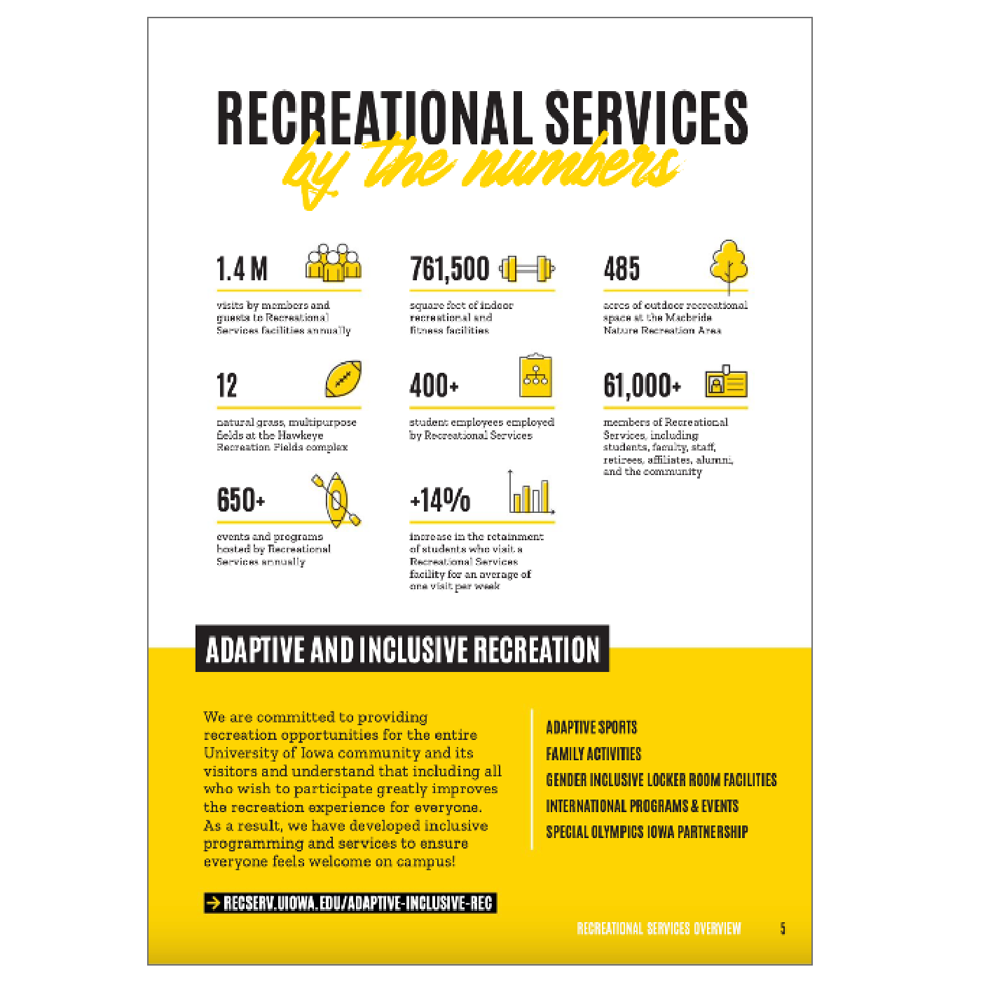
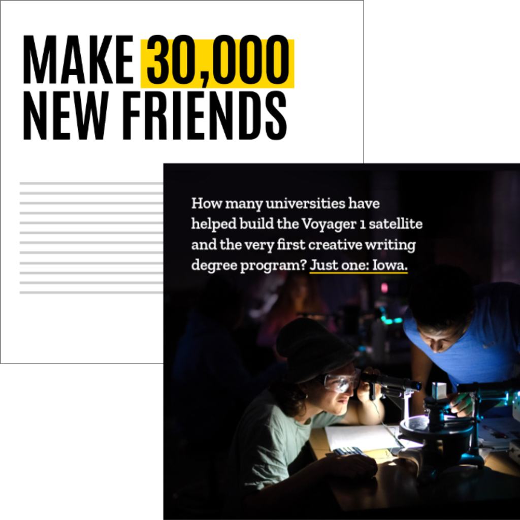
Use icons to support and call attention to fun facts or statistics.
Use icons to support messaging only when a unit identifier is used separately.
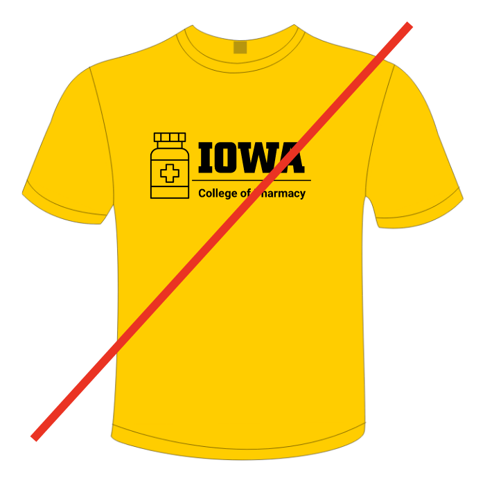
Don’t combine icons or illustrations with official lockups or trademarks.

Don’t use icons for identification or as primary artwork.
Choosing the right visual: a quick reference
In today’s media-rich world, being strategic about the visual assets you choose is essential. Icons, illustrations, and photos each offer unique benefits that can enhance the engagement and clarity of your content. Recognizing the differences between these visual assets and how to leverage them effectively will make it easier to create content that connects with your audience and authentically represents the Iowa brand.
Icons
Simple, universal symbols that represent concepts, actions, or categories.
- Compact
- Scannable
- Easy to interpret
- Next to a fun fact or statistic
- Alongside headings in a short list
- As a supporting visual to aid site navigation

Illustrations
Detailed and expressive visuals that depict more complex ideas, scenes, or narratives.
- Can stand alone
- Convey personality, style, and tone
- Showcase complex concepts
Usage examples
- Demonstrate interdisciplinary collaboration
- Provide visualization to an abstract research concept, such as audio sound waves
- Show steps in a process, such as how a product moves through the supply chain

Photography
Documentation and recording of real-life scenarios and moments in time.
- Evokes emotion and creates connection
- Offers authentic depictions of people and events
- Offers high-quality, high-resolution visuals
Usage examples
- A student portrait used in featured content
- Showcase events, student activities, classes, labs, and research as it happens
- Serve as documentation and historical record of campus spaces
See Imagery guidelines for more.
Highlights and lines
Highlights and lines are a useful way to create emphasis or hierarchy within headlines and display text. Styles can be set up within Adobe InDesign to help make them consistent.
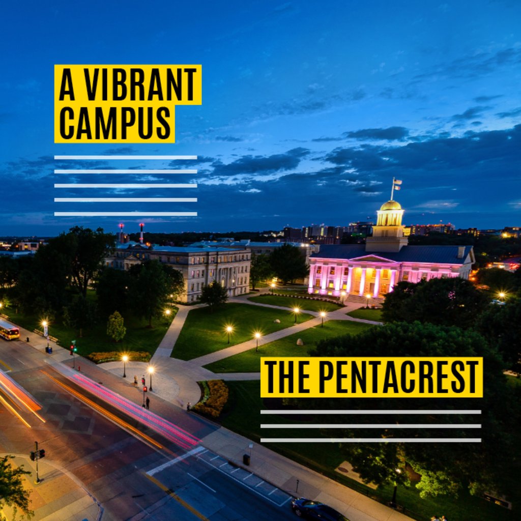
Highlight to create contrast
Use highlights to emphasize display text and improve legibility over photography. Using black and gold highlights visually intertwines our brand colors with our messages.
Emphasize words
Align highlights directly behind text or offset slightly when over white backgrounds. Line weights should be consistent and based on other design elements within your layout, for example text weight.

Use lines to organize
Use dividing lines to establish hierarchy and guide navigation within a layout. Always establish a consistent line weight throughout an entire piece.
Charts and graphs
Visually representing data can play an important role in communicating clearly with our audiences. From presenting casual information graphics to detailed research data, the styling used for charts and graphs must support our overall visual identity.
Guidelines
- Use black and gold predominantly. Add secondary colors only when there are several data points to compare within the same graph and more contrast is needed to differentiate.
- Use Roboto for data figures. Roboto Condensed can be useful for displaying data figures when space is limited.
- Don't use narrow bars or make the fill area of a donut chart thin; their visual weight should be consistent, substantive, and feel similar in weight to our block IOWA logo or the highlight element shown above.
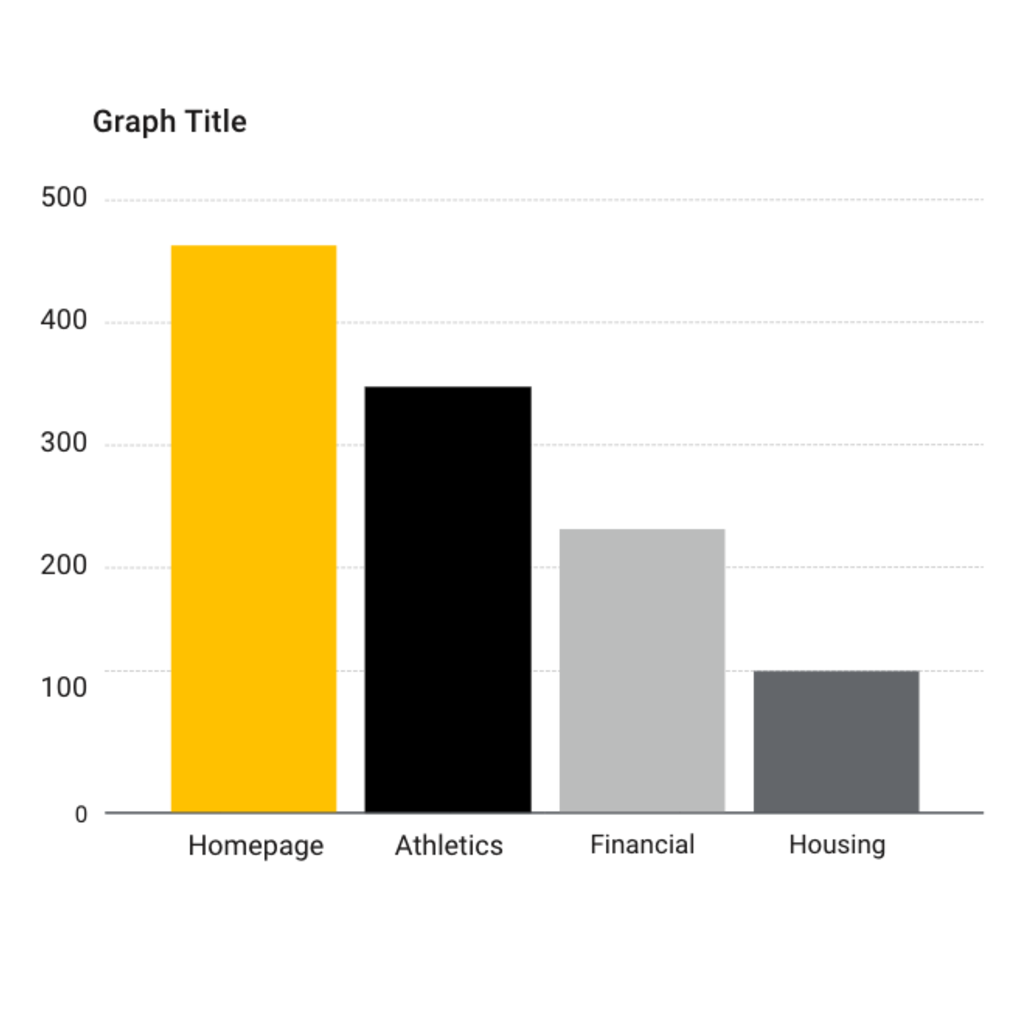
Bar graph
Use bar graphs to compare one data point versus another or to track changes over time. Bar graphs demonstrate large differences better than small ones.
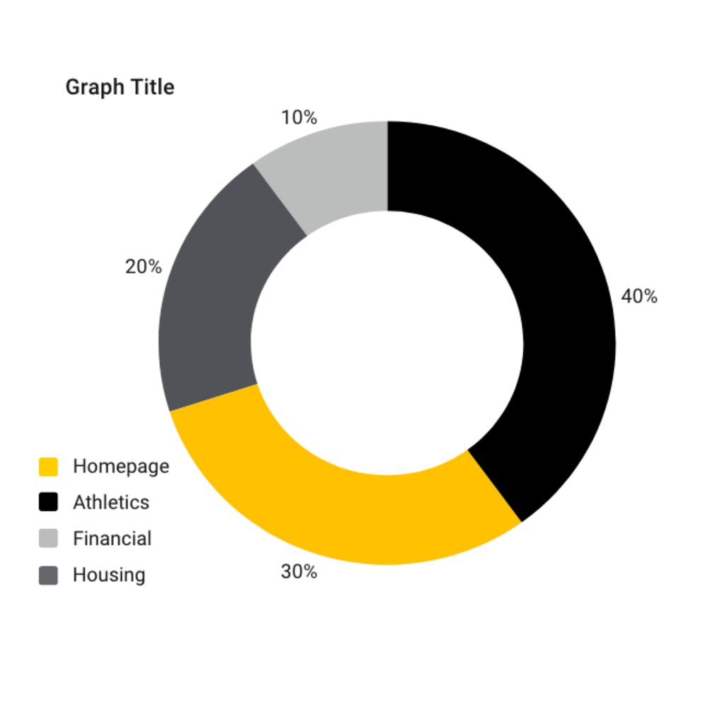
Donut/pie graph
Use donut and pie charts to compare parts of a whole. Aesthetically, donut charts are preferred within our visual identity and offer the ability to show more than one data set in the same chart.
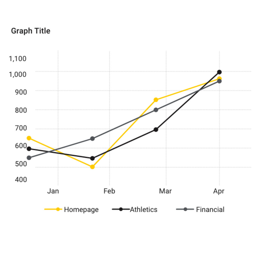
Line graph
Use line graphs to display small changes in a trend over time. Use heavy line weights for better visual density of our black-and-gold color palette, generally 2 to 4 points.
Download our printable visual identity poster to use as a quick reference guide to some of our most important identity elements.