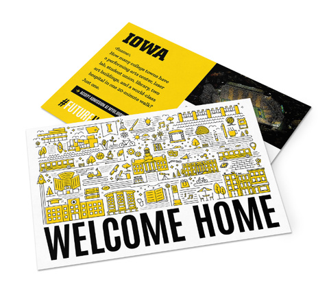
Our brand is built around flexibility while maintaining consistency, allowing you to create a final piece that is uniquely Iowa. The guidelines below are informed by our creative strategy—giving you specific tools to work with as you create printed marketing materials.
Define your goal
Before starting a design project, use the creative brief to define your objective, identify your audience, and build a solid foundation to keep your project strategically focused.
Lead with your message
Use typography to create bold visuals with your headlines—keeping them short and direct, but compelling enough to draw a reader in. Select imagery that supports your message and helps your audience quickly understand what the content is about.
Create contrast
Careful use of contrast establishes a clear visual hierarchy—drawing attention to the most important facets of your design and message. While our color palette creates immediate opportunity for contrast, the use of negative space, different sizes, shapes, and positioning of our visual elements also play a role in creating contrast and lending energy to layouts.
Strike the right tone
How we weave together the elements of our visual identity with our content can change the overall tone of the piece, making it more relevant to your audience and ensuring that it meets your objective. While the same creative strategy applies to both informal and formal communications, the type of content and use of visual elements can be adjusted to strike the right tone with your audience.
Informal
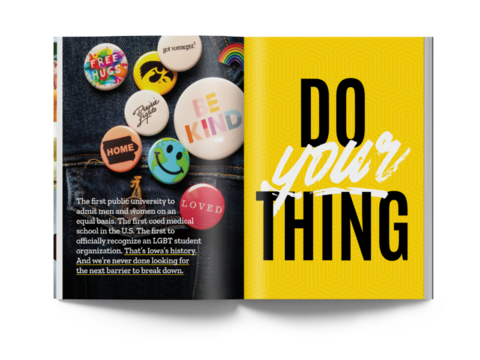
Who and what
- Content is usually more emotive and illustrative
- Prospective undergraduate recruitment marketing
- Undergrad events or promotional items
- Alumni events and collateral
- Environmental signage/branding
How
- Use black and gold liberally, but balance it with ample negative space for readability.
- Leverage the secondary palette to accent key pieces of information or break up content.
- Use bold and oversized typography for headlines to quickly deliver your primary message.
- Use more imagery than text.
Formal
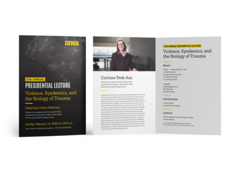
Who and what
- Content is more informative, specific, or sensitive in nature
- Graduate/professional student recruitment marketing
- Administrative or official documents or communications
- Academic ceremonies
- Faculty recruitment and events
How
- Keep it neutral by leaning more on black, grey, and white, but leverage gold to add contrast or accent key pieces of information.
- Keep headlines more modest in size relative to the body content, and limit the use of capitalization.
- Prioritize your text and supplement with imagery.
Using a layout grid
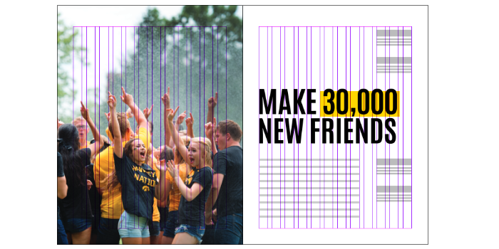
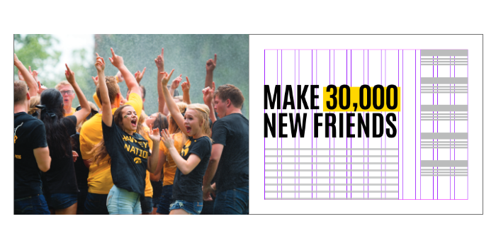
To maintain a consistent look across communications, always use a 12-column grid system when creating print collateral. The grid system creates a framework that gives elements a common structural relationship and makes it easy to organize content and imagery efficiently.
See the brand in action
See more examples that showcase how our brand assets can work together to represent our brand and serve our audiences.
