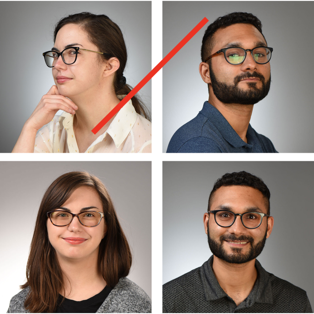
Head and shoulder portraits are a great way to show individuals within your department or unit. We recommend campus photographers follow these guidelines in order to capture consistent and high-quality portrait photography of people appearing on your website.
Things to keep in mind
- Use a consistent focal distance and backdrop. This creates a unified appearance for your team’s portraits when they appear next to each other on contact or directory pages.
- Use a good light source. Overdramatic lighting will create shadows or wash out your subject.
- Pay attention to posture and pose. Be sure your subject is comfortable and positioned in a professional pose.
- Avoid fine prints or patterned clothing. Solid colors work best. Fine prints or patterned clothing can draw attention away from the subject and create moiré patterns when portraits are displayed digitally.
- JPEG and PNG files work best for digital applications. Save images for screen resolution and keep file sizes to 2 megabytes or less to reduce page load times for your website.
Update your portrait during photo studio hours:
- All faculty, staff, and students are welcome to have a professional portrait taken during walk-in photo studio hours.
- The photo studio is managed by the Office of Strategic Communication and located in Plaza Centre One.
- Walk-in studio hours are updated each semester and listed online.
Portrait examples

Posture and pose
Make sure your subject is relaxed and not tilted in any way. A relaxed posture will help to capture your subject's authentic expressions and look more professional.

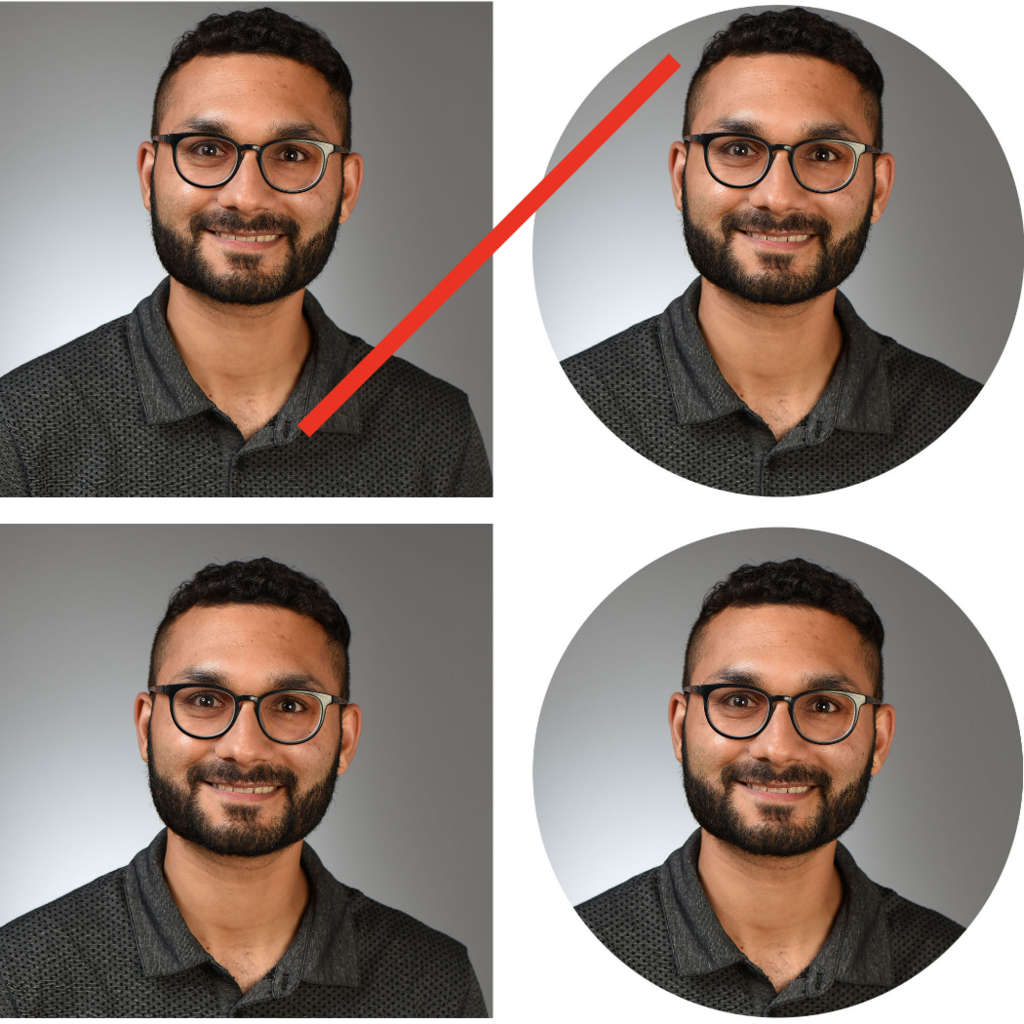
Frame and cropping
Leave space above the subject's head and do not crop too wide or tight. Images taken in the OSC portrait studio are suited for ideal cropping to circular directory image frames.

Lighting and focal distance
Make sure your subject is situated at an appropriate distance from the camera and avoid overdramatic or washed out lighting. A well-lit portrait will ensure your subject's face and expressions are being captured.